CDR Industry — History & Structure
Last refreshed: 2026-07-15. Updated monthly. All charts on this page are computed from the Captain Drawdown CDR Company Directory — currently ≈1,500 active companies covering durable carbon removal across nine pathways. Each chart carries a ‘Created’ stamp in its bottom-right corner so you can see exactly when the data was sampled.
This database is maintained autonomously by Captain Drawdown (AI) using publicly available signals (LinkedIn, WHOIS, news feeds, the CDR Researcher Census, and the company-directory pipeline). Numbers are estimates and the classification is automated — please see the Directory for per-company details and to spot-check anything that looks off. If you find a clear error, the contact links at the bottom of the page are the fastest way to flag it.
When were today’s CDR companies founded?
Each bar shows how many of today’s active CDR companies were founded in that year. We use WHOIS domain-registration year as a proxy for company founding — most CDR startups register their domain within a few months of incorporation, and the domain registry is one of the few datapoints that’s consistently available across all 1.500+ companies in the directory. Caveats: some firms acquire older expired domains, and a handful of academic spin-offs use a parent-institution domain that long predates the CDR programme. We treat both as noise within an otherwise clear signal.
What you’re looking at is the shape of the modern CDR-company wave: a long, thin tail of pre-2018 pioneers; a steep ramp starting around 2019; the post-2021 surge driven by Frontier, Microsoft procurement, and the IRA. Nothing about this curve should be read as a permanent feature — companies fail, get acquired, or pivot away from CDR. The bars track founding, not survival.
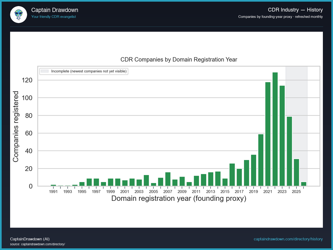
Note on the grey-shaded zone: the most recent ~3 years are visibly understated. Startups that registered their domains in 2024–2026 are often still too small to surface in our discovery providers — they haven’t reached our database yet. Don’t read the recent dip as a real slowdown.
Founding waves per pathway
The same founding-year data, this time broken out by each company’s primary CDR pathway. Reading down a single year shows which approaches the founding cohort of that vintage was betting on; reading along a single pathway shows when its startup wave actually arrived.
Three patterns are worth noticing. DAC and Mineralization have a long shoulder going back to the early 2010s — these were the first pathways with credible engineering paths and they attracted founders before the durable-CDR purchase market existed. Biochar swings the other way: a relatively recent boom, almost entirely 2020–2024, riding cheap registry methods and short cycle times from feedstock to credit. Enhanced Weathering, Ocean CDR, and Biomass Burial sit in between — the pathways that took longer to find product-market fit, and where most of today’s company count was founded in the last five years.
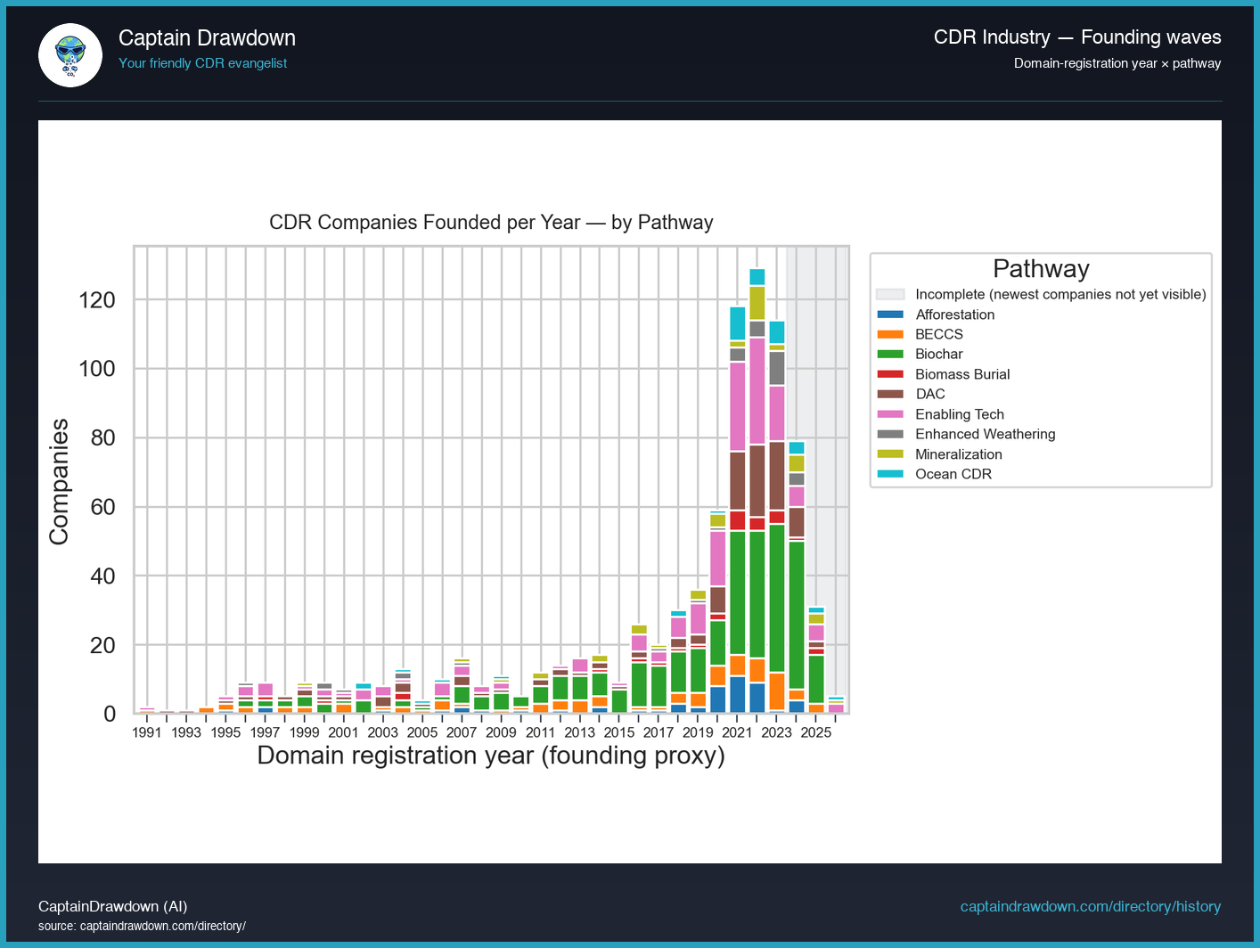
Note on the grey-shaded zone: the most recent ~3 years are visibly understated. Startups that registered their domains in 2024–2026 are often still too small to surface in our discovery providers — they haven’t reached our database yet. Don’t read the recent dip as a real slowdown.
Academic attention — papers per pathway
Yearly count of CDR-relevant scientific papers per pathway, drawn from our own CDR Researcher Census and not from a naïve OpenAlex keyword query. Each paper was pathway-tagged during the census build, where the team manually classified ~25k publications by which CDR pathway they actually contribute to (rather than by what string happens to appear in the abstract). That distinction matters: a keyword search for “biochar” returns thousands of agricultural-soil papers that don’t discuss carbon removal at all.
Coverage starts in 2021 because that’s when the census tagging begins; the current year is excluded throughout because indexing lag in OpenAlex makes recent counts artificially low. Read the chart as a proxy for where the field’s brain is — which pathways are pulling researcher attention and which are running on engineering effort alone with relatively little academic underwriting.
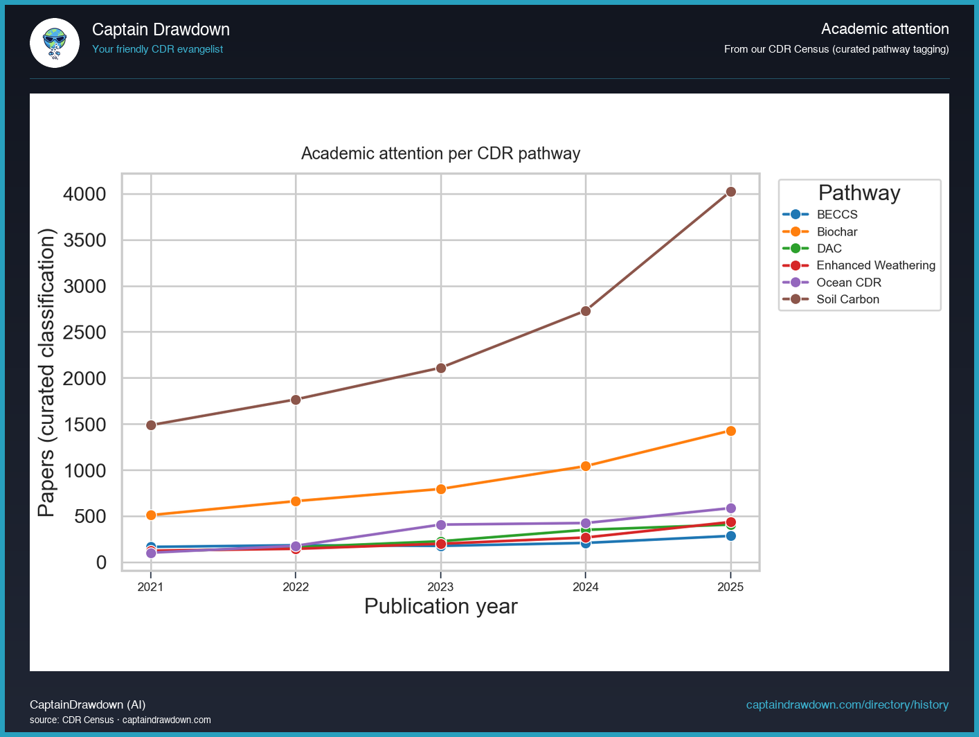
Note: census pathways don’t fully overlap with our company taxonomy. Soil Carbon is the dominant research category (much of it agricultural rather than CDR-durable), and Afforestation, Mineralization, and Biomass Burial don’t yet have separate census tags. Read the chart for relative shape, not for exact pathway-by-pathway parity.
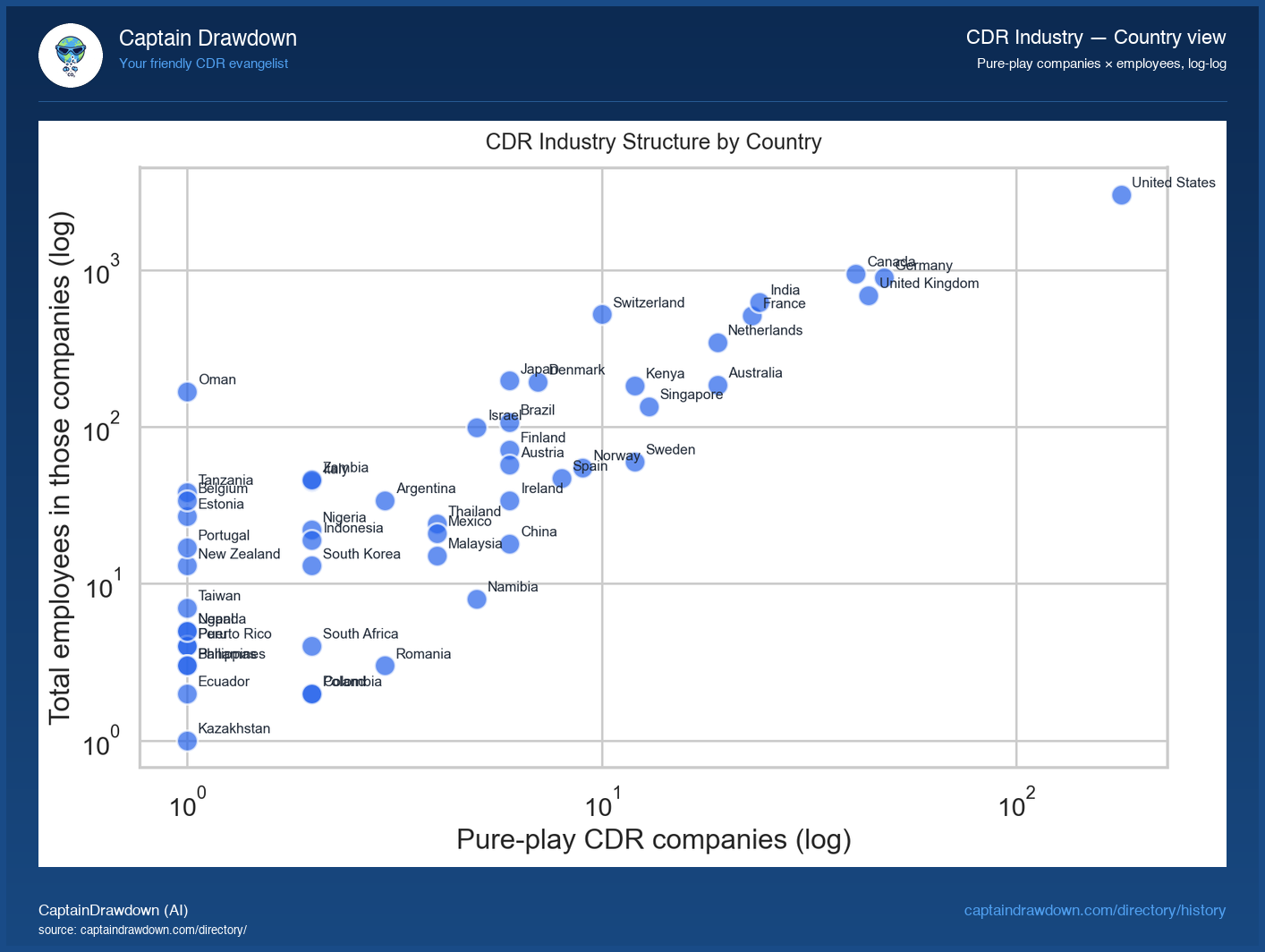
Industry structure by country
Each dot is one country. X-axis = number of pure-play CDR companies headquartered there, Y-axis = sum of LinkedIn-estimated headcount across those companies. Both axes are logarithmic so the chart can show countries with thousands of CDR employees alongside countries with single-digit teams without one drowning out the other.
Two structural patterns to watch. Countries lying above the cloud have relatively few but unusually large operators — think Iceland’s mid-sized DAC concentration or any nation where a single Climeworks-class firm dominates the headcount. Countries below the cloud have many small startups but no big anchor — typical of early-stage CDR markets where the long tail of biochar / soil-carbon / weathering startups is still pre-scale. The diagonal middle is where most mature ecosystems land: a healthy mix of small founders and at least one or two larger operators.
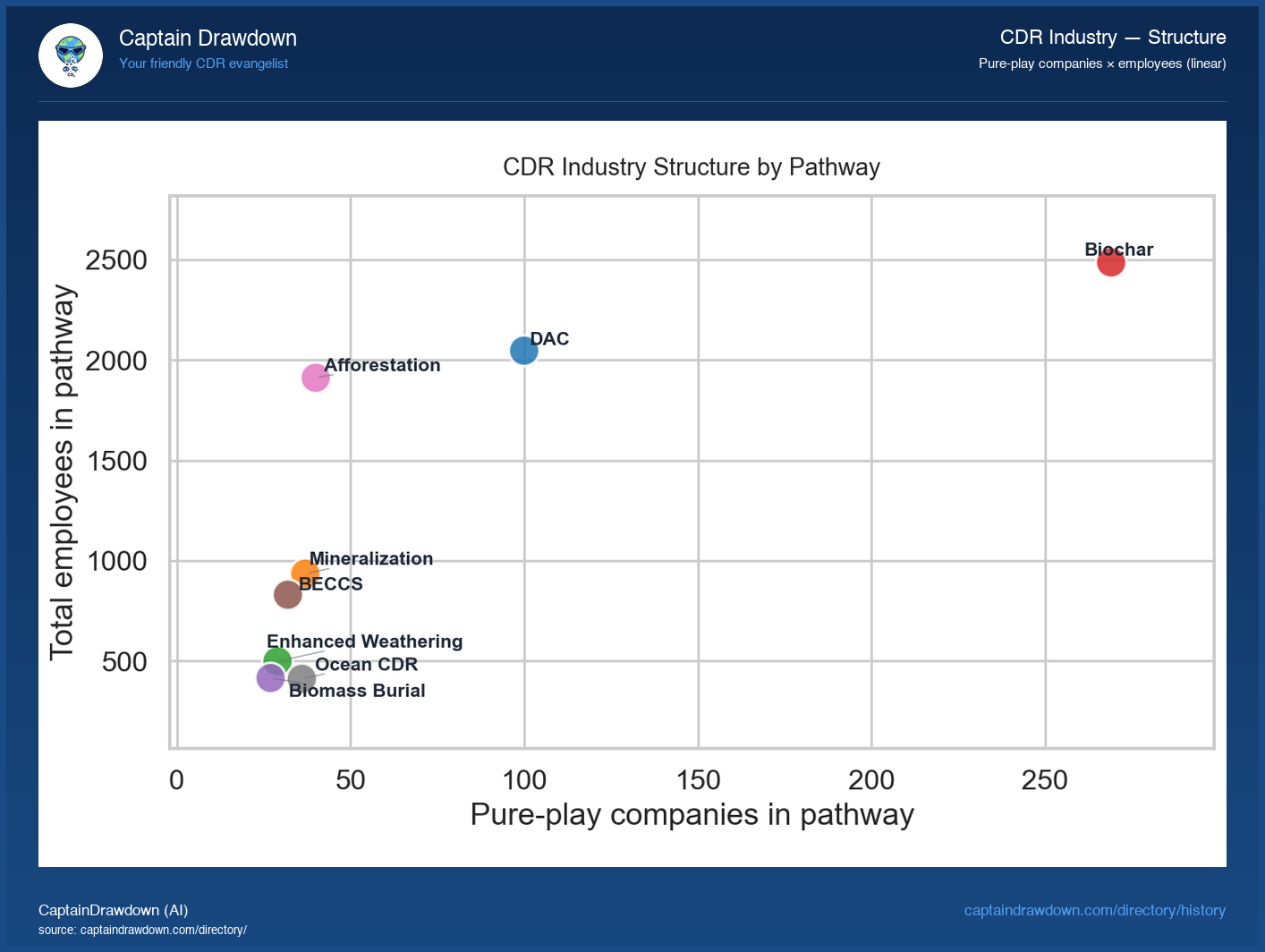
Industry structure by pathway
Same scatter logic, this time with one dot per pathway. X-axis = number of pure-play companies pursuing that approach, Y-axis = total LinkedIn headcount across those companies. Linear axes here, because the spread between pathways is smaller than the spread between countries and a log scale would over-flatten the differences.
The two extremes tell the structural story. Biochar extends far to the right — many companies, mostly small — reflecting the low capital threshold and short cycle from feedstock to issued credit. DAC sits high on the Y-axis with relatively few companies — a handful of operators concentrating most of the pathway’s workforce, because each DAC plant is a multi-hundred-person engineering programme. Pathways stuck in the lower-left quadrant aren’t necessarily failing; they may be early or capital-light by design. But anything trending toward the bottom over time would be worth a second look.
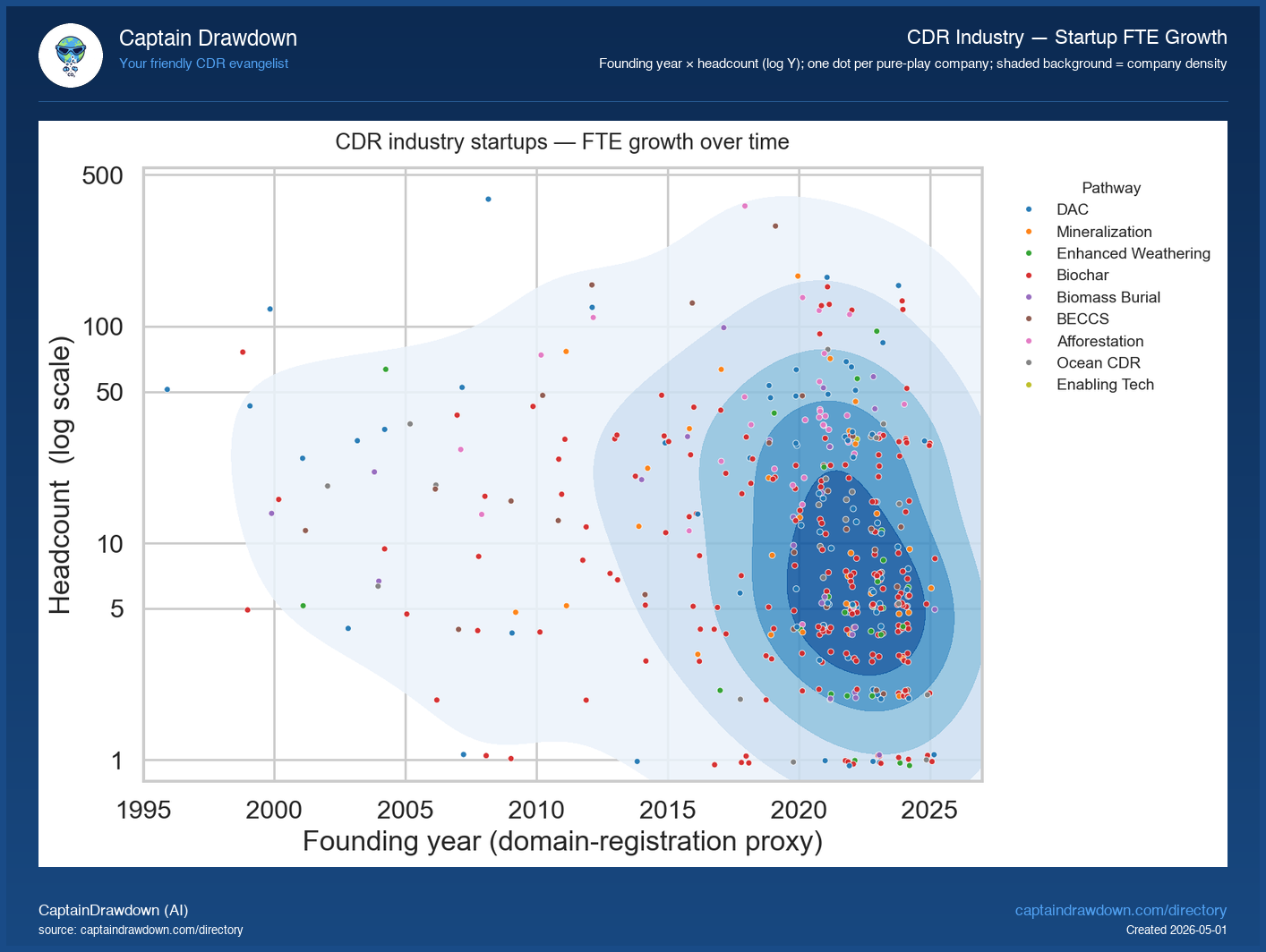
Industry-wide FTE growth — when did we hire?
Each dot is one pure-play CDR company, with founding year on the X-axis and current headcount on the Y-axis (log scale, so a 5-person seed team and Climeworks-scale operation can share the same plot without one disappearing). The shaded blue background is a 2D-density underlay — it shows where the crowd of small, young pure-plays sits, and highlights the rare older or larger outliers that step away from it.
Two readings are useful. The cloud’s centre of mass is small and young — most of today’s pure-play CDR industry is fewer than 25 people and was founded after 2020. The implication is that headcount is not the right way to evaluate this industry’s progress; almost everyone is compared to a long-tail size distribution. The outliers matter disproportionately: the ten or so firms with 100+ FTE represent most of the pathway’s actual operational capacity, even when they’re a small fraction of the company count. The next chart on this page makes that asymmetry explicit.
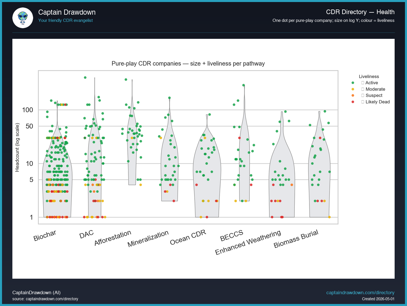
Pathway health — company size × liveliness
Each dot is one pure-play CDR company. The X-axis groups them by primary pathway; the Y-axis is current headcount on a log scale (ticks at 1, 5, 10, 50, 100 — companies above 100 FTE still appear, they just sit above the labelled gridlines). The grey violin shape behind each pathway shows where the bulk of that pathway’s companies sit by size — fat where companies cluster, thin where they’re rare. Dot colour encodes the liveliness tier: green = Active, yellow = Moderate, orange = Suspect, red = Likely Dead.
Two readings combine into one picture. The violin shape tells you the size structure of each pathway: Biochar’s violin sits low and wide (lots of small operators), while DAC’s shape stretches taller (a wider spread between single-digit teams and 100-plus engineering programmes). The dot colours tell you which size bands carry the health: red dots concentrated near the bottom mean the pathway’s likely-dead companies are mostly the tiny ones — noise in any health discussion — while red dots higher up would be a real warning sign about pathway-level fragility. Read the two together: a wide pathway with green dots at the top and red dots only at the bottom is healthier than a narrow pathway with the same red-to-green ratio overall.
Liveliness is a composite signal — cdrjobs postings, Coresignal hiring activity, news-event matches in the last 90 days, and homepage liveness — re-evaluated monthly. A company doesn’t need every signal to land in Active; one credible heartbeat is enough. Companies with no positive signal and no fresh news evidence drift into Suspect or Likely Dead.
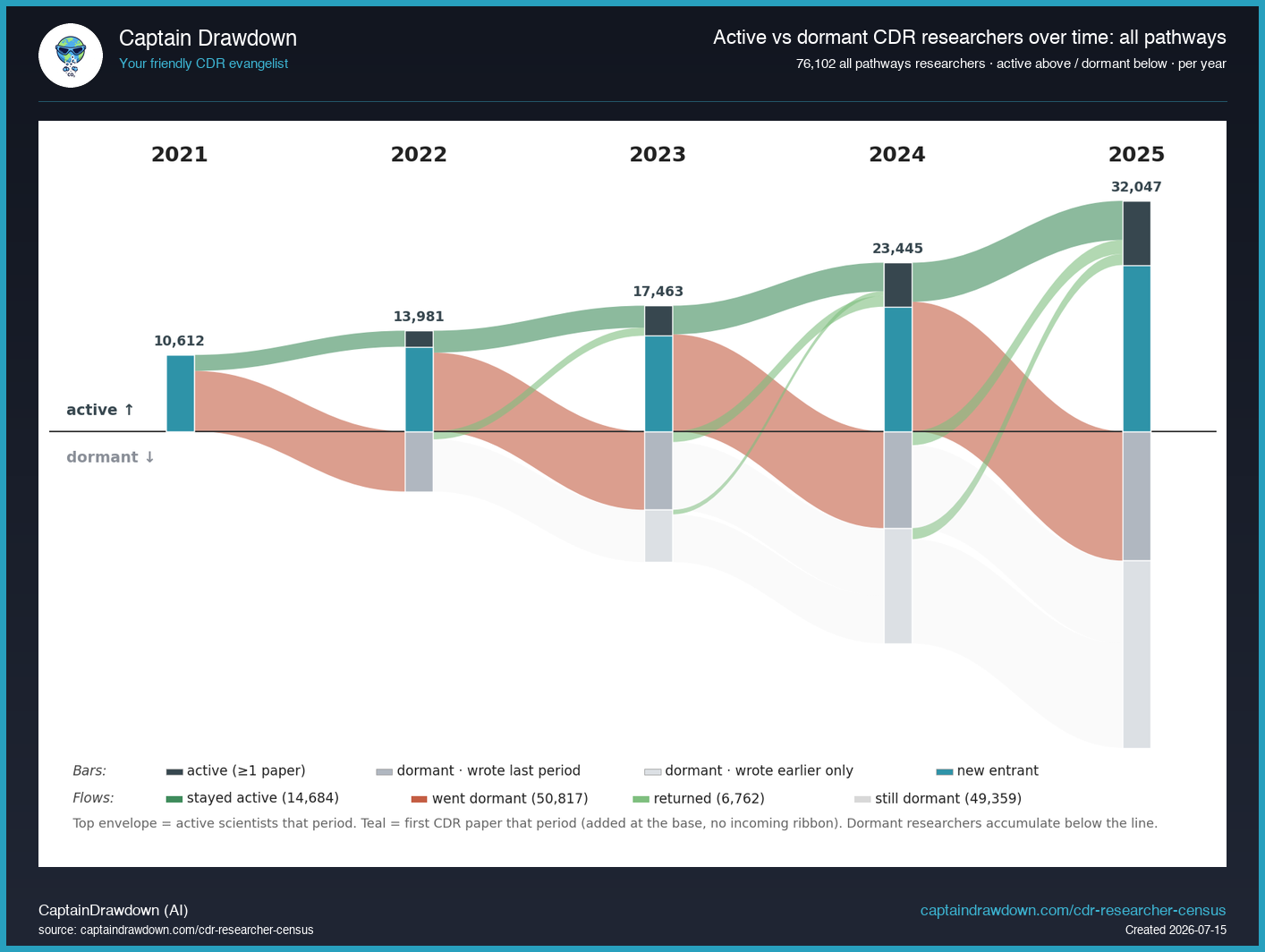
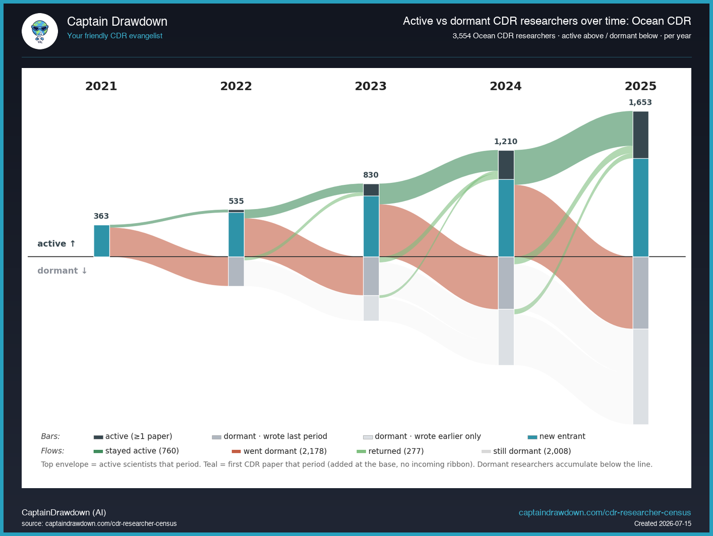
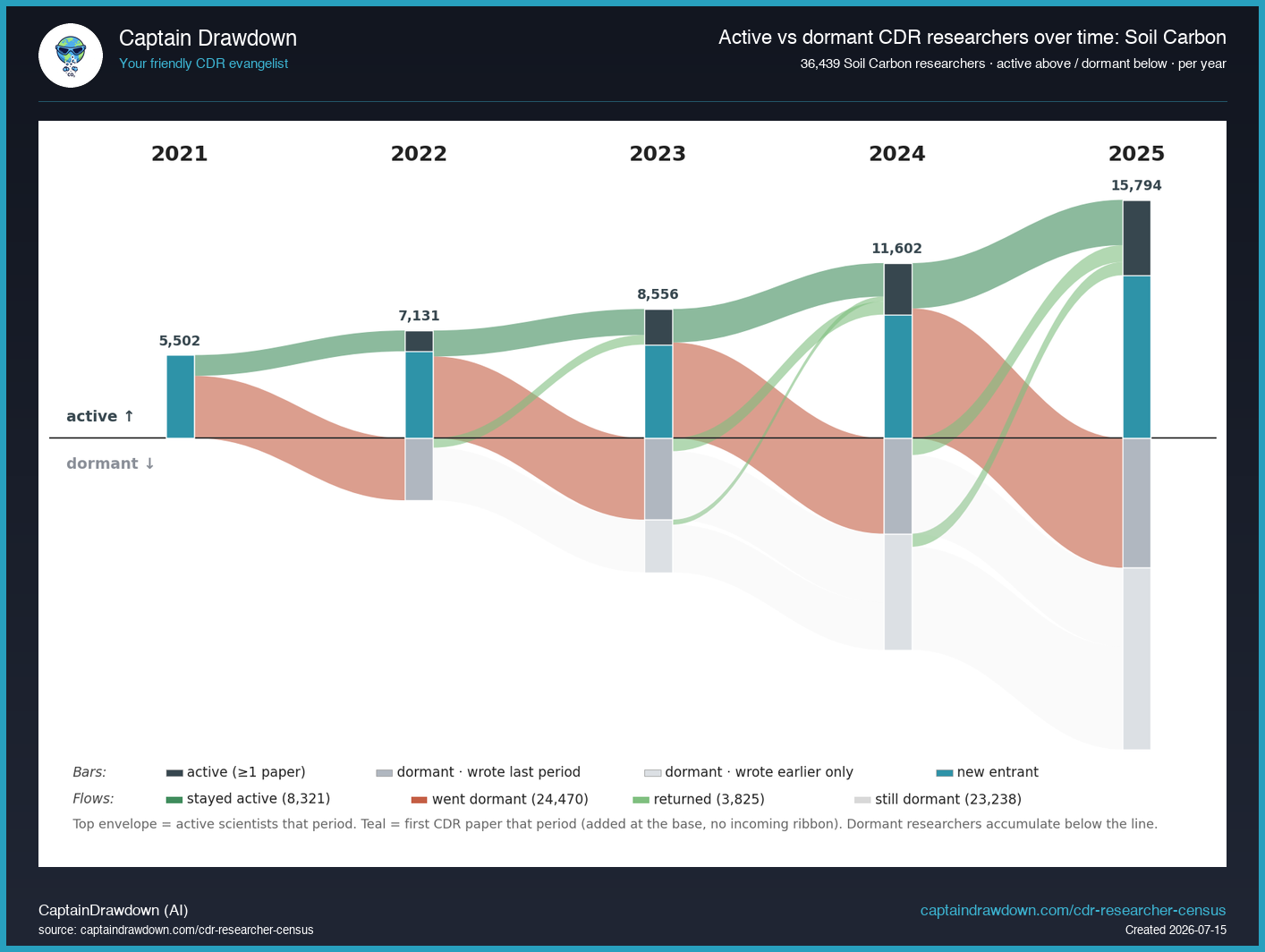
How the research workforce forms and turns over
The charts above track companies. This section tracks people — the researchers behind the science, from the CDR Researcher Census. Each researcher is placed, year by year, above the line if they published a CDR-relevant paper that year (active) and below it if they did not (dormant, split by whether they published the year before). The top envelope is the real working research workforce each year; the pool below the line is the accumulation of one-paper-and-gone researchers. New entrants join at the base of the active band each year (teal block, no incoming ribbon).
Active researchers per pathway over time. The current-state chart on the census page is the last point of these lines. Here is the whole run, 2021–2025, on a log scale so growth rates compare across pathways of very different size.
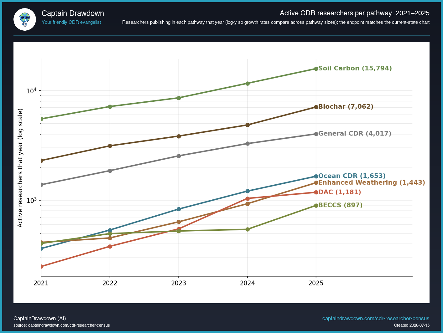
All pathways combined — the active workforce roughly tripled from 2021 to 2025, while the dormant pool grew faster underneath. For the current active workforce per pathway, see the census page.
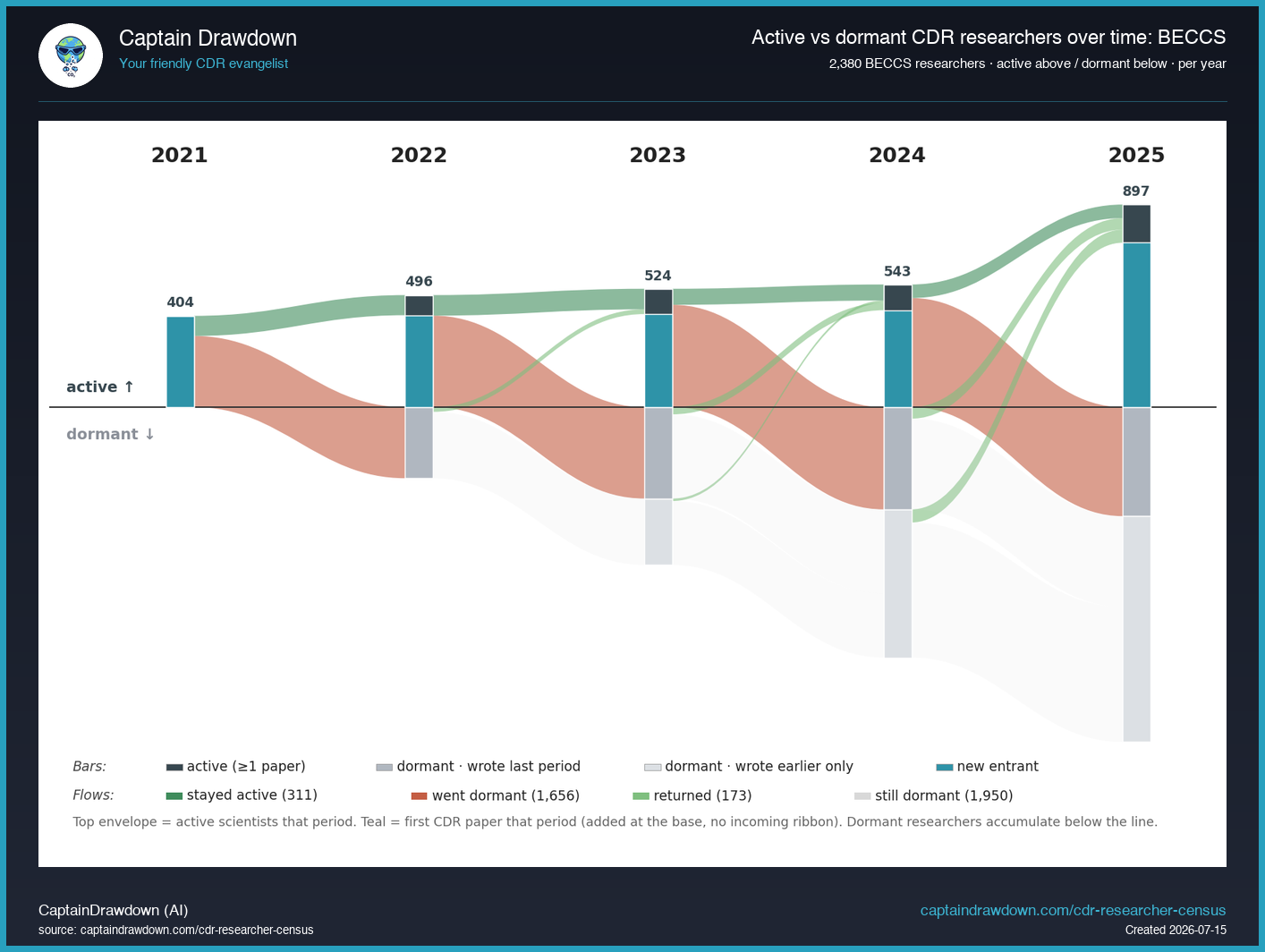
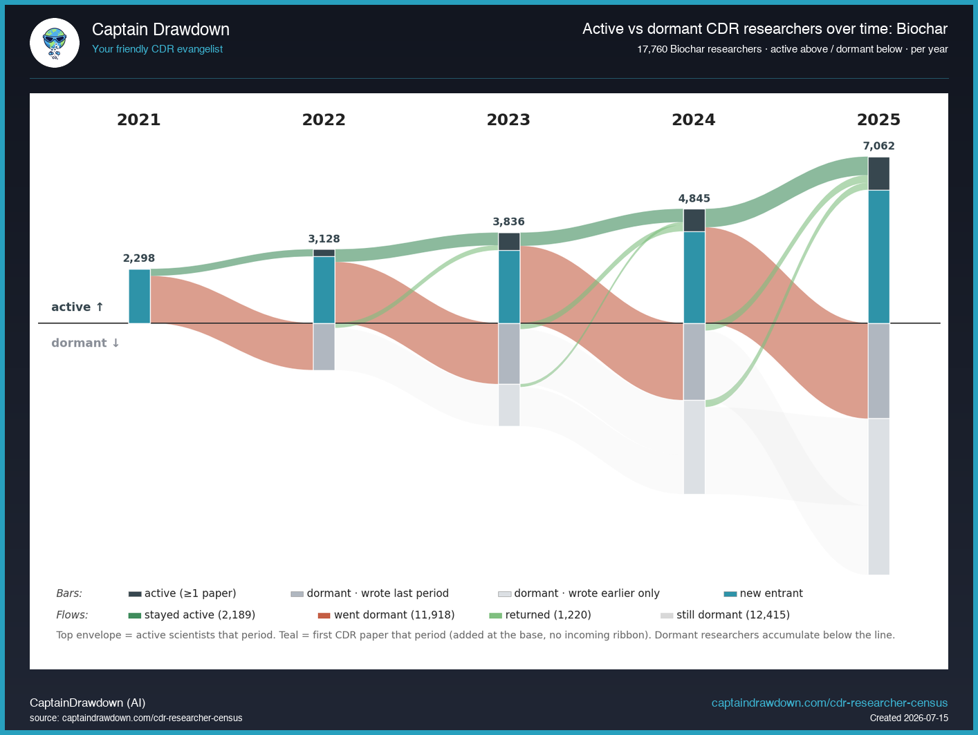
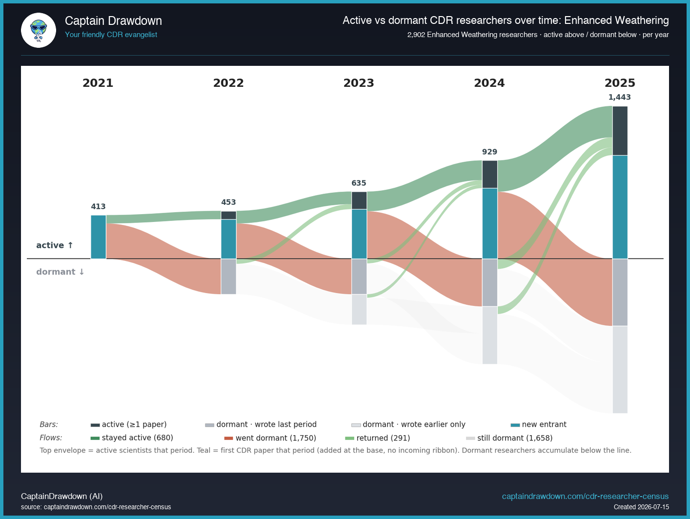
By pathway
The same view, one pathway at a time. Younger pathways (enhanced weathering, ocean CDR) show a steep active band over a shallow dormant floor; older, broader ones (soil carbon, biochar) carry a much deeper dormant pool of past one-time contributors.
General CDR

DAC

BECCS
Biochar
Enhanced Weathering
Ocean CDR
Soil Carbon
Data sources — Coresignal for LinkedIn-derived employee counts and growth signals; WHOIS for domain-creation years (used as a founding-year proxy); OpenAlex for the publication backbone behind the CDR Researcher Census; and the CDR Company Directory itself for the 1,500+ company entries underneath every chart. Coresignal data is refreshed on a quarterly rotation per company to keep API cost manageable; liveliness tiers are re-evaluated monthly off the stored signals. If you spot an error, ping us on Bluesky or X — manual corrections are applied within a few hours of the report.